Data Visualisation stories
Construction firms could cut costs and delays by using digital replicas to spot failures, test designs and improve sustainability before build-out.
Bridge checks could become cheaper and more consistent as Waterloo researchers use autonomous robots, cameras and lidar to spot defects.
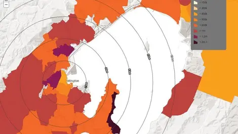
Home buyers can now compare suburb-level price shifts at a glance, as CoreLogic's map shows where values have risen, fallen or held steady.
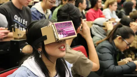
Students will visit hazardous building sites and leaky-home repairs virtually, as the University of Auckland tests low-cost VR teaching tools.
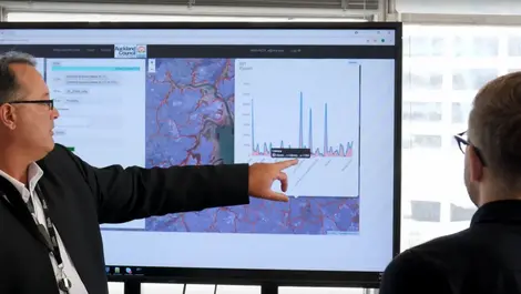
Planning decisions in Auckland will now be based on data processed in two days rather than months, as the council moves its portal to AWS Cloud.
Auckland households can now check whether rooftop solar will pay off, using a free calculator that maps shading and roof angles.
Work-related illness and injury are stripping 3.9 per cent from global GDP each year, as poor safety measures carry a heavy economic toll.
Councils could gain a clearer picture of housing pressures as a new MBIE dashboard maps demand, supply and affordability data.
Enlighten Designs CEO Damon Kelly discusses the company's business journey and vision for the future of web design in TechDay interview. #webdesign.
Dynata's data capabilities and technology will power The Hub, Hall & Partners' data visualisation and storytelling platform.
The award, which recognises Qlik Data Integration, highlights the benefits of the strategic alliance between Qlik and Snowflake.
StructureFlow debuts, promising to revolutionise legal & financial visual data analysis with speed & collaboration.
The medical data visualisation sector is set to exceed USD$95 billion by 2027, driven by increased data use, 5G, and cloud BI solutions, says Zegami.
The biggest increase in the use of data visualisation tools is expected to be in academia and research, financial services and healthcare.
The acquisition of Infruid Labs brings analytics and data visualisation with a simple user interface to Pega's solutions.
Its secure data analytics platform adds this plus other new capabilities for greater business insights and data visualisation.
With offerings such as the Simble Energy Platform, Synnex Australia and Simble are bringing IoT to the local channel in a big way.
Tomasz Bednarz of the UNSW EPICentre explains how he and his team are advancing data analytics by bringing technology and design under the same roof.
ChannelLife sat down with Professor John Taylor, a local titan of GPU-powered research, to ask about how GPU tech is going to change this country.
Avolution has released Abacus 5.1, offering new 3D data visualisation, faster processing, and icon libraries for executive reports.